If This Finds You · a handwriting engine
I needed a handwritten font for Rueca's brand, something that looked like a real person wrote it. Every one I tried drew the same e every time. Real handwriting never does that, and once you notice it you can't unsee it.
So I tried making one. As usual, it got a little out of hand.
The first version
My first version started from Dr. A. V. Hershey's stroke letters, drawn in 1967 for early computer plotters. A seed added variation on top. It moved like handwriting, but every writer looked like the same person. The letter shapes came from a plotter font, not from how anyone actually learned to write.
Handwriting is learned. Everyone's hand starts from the model they were taught at school and changes from there. To get a believable hand, I needed those school models.
Tracing old copybooks
Copybooks are the books kids copied their letters from. Plenty of them are scanned and in the public domain. I picked eight, from Arrighi's chancery hand, printed in Rome in 1522, to the Sütterlin script German schools taught in 1917. In between: a Dutch running hand, a Spanish bastarda, Spencerian, Palmer's business hand, and Polish and Norwegian school hands. Volunteers in Québec and France filled in how people write today.
I traced every letter into a single-line skeleton, the path the pen travels rather than the outline of the ink. That choice ended up shaping the whole project. Everything the engine does later, the slant, the wobble, the speed, happens to that path.
How a seed becomes a writer
The copybook gives the letter shapes. The seed decides what one person does with them.
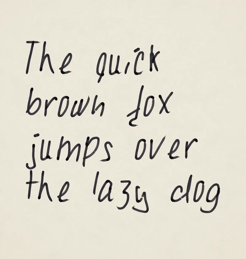
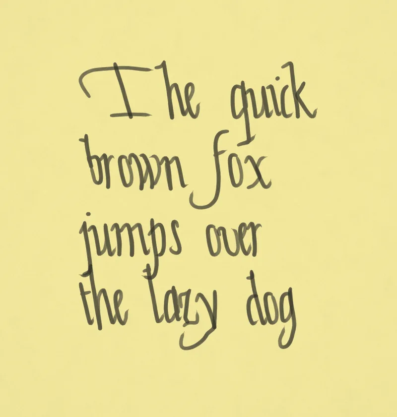
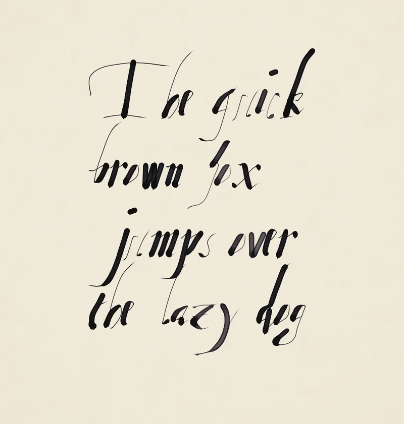
A seed picks which school a writer learned from and how far they drifted from it: slant, size, spacing, rhythm, the letters they always rush. On top of that, the variation stacks the way it does on paper. The page drifts, a line wanders, a word speeds up, a single stroke wobbles. A simulated pen puts it down, so the ink follows the speed and pressure of each stroke. It pools where the pen slows and darkens where strokes cross. Writers slip, and they cross things out the way they were taught to.
So the same letter never comes out twice, which is exactly what a font can't do.
Claude built the engine with me, and the rule I kept repeating was that real hands are allowed to be ugly. If it's a bug, fix it. If it's just an ugly letter, leave it. Most of my design calls were about protecting that.
Real letters and free fonts
The hands needed something to write, so I collected 123 real letters, mostly from ordinary people we only know because one letter survived. Emigrants writing home, settlers, kids writing to Santa. A writer who never existed writes each one out live, and that became the site. The name comes from how a message in a bottle begins.
Every hand is also a free font you can download, and there are over a million of them, since each of the 110,160 seeds can write in any of 13 traditions. A font file only holds four or five versions of each letter, so it cycles through them as you type. The live engine never repeats a letter.
Notes
Once I could read in these hands, I wanted to write in them. So I'm building Notes, a notes app where you pick a hand the way you'd pick a font.
Typing behaves like ink. The pen writes about a second behind you, so a typo it hasn't reached yet just disappears. Once a word is inked, Backspace crosses it out. Hold it and the word gets scribbled out. Put the cursor between two words and the new one goes above the line with a caret. Undo on dry ink writes "stet" and brings the word back. Formatting is by hand too: titles, lists, checklists, underlines, a highlighter.
The hand also follows how you type. Type in a rush and it gets hasty. Slow down and it tidies up.
Every notes app I've used treats a mistake as something to delete. Paper keeps it. A crossed-out word shows someone changing their mind, and I wanted a notes app that keeps that. So nothing in it is ever erased.
It's a quick experiment, and still early.
Try it
Read a letter at ifthisfindsyou.app, write one in Notes, or take a hand home from the fonts.
All of it is free and open source. The fonts are under the SIL Open Font License, and the code is on GitHub under MIT.
The generator above runs a snapshot of the real engine (MIT). Its hands come from public-domain copybooks, Dr. A. V. Hershey's fonts, and two CC BY 4.0 sources: Copiste d'un jour by Bibliothèque et Archives nationales du Québec (2024) and CREMMA-Wikipedia by HTR-United (2022–23).